
Print-ready files.
We get the same questions on almost every order. What logo file should I send? Why does my color look different? Will my AI logo work? It's all answered here, so we can skip the back-and-forth and get straight to designing.
Why your logo file matters.
A business card is about 3.5 inches wide. A back wall is about 10 feet. That's your logo stretched more than 30 times bigger, and whether it still looks good depends on how the file was made.
Vector files
An .ai, .eps, .svg or .pdf from whoever designed your logo. Not sure what to ask them for? Say "vector files" and they'll know.
High-resolution PNG
The biggest one you can find, at least 3000 pixels wide. A transparent background is a bonus.
Whatever you've got
A JPG, a screenshot, the logo off your website. Send it over anyway and we'll tell you straight up whether it'll hold up.
Is my file really vector?
Not necessarily. A file can end in .ai, .eps or .svg and still not be a vector. A lot of the time it’s just a JPG that was placed inside one of those formats and saved. It looks fine on your screen, but when we open it in Illustrator there’s nothing to work with. No paths, no editable shapes, just a flat, low-res image we can’t resize or change.
That matters a lot in our world. A logo that looks fine in an email will print soft and pixelated on a 10-foot backdrop.
How to check: open the file and zoom in as far as it’ll go. If the edges stay sharp, it’s a vector. If they blur or break into little squares, it’s an image.
Not sure? Upload it to your Client Portal. We open every file in Illustrator before anything goes to print, so if something’s off, you’ll hear from us first.
That AI logo might not scale.
These days a lot of logos come to us straight out of an AI image app, and some of them look really cool! The catch is they're made for screens. They're great as a reference, but usually can't be printed at large-format size.
Why they don't hold up
- They're made of pixels, even if the file says .svg, .pdf or .ai.
- Edges go soft and the little details turn to mush once they're blown up.
- The lettering is usually a little off: wobbly lines, letters that don't quite match.
- There are no real color codes behind them, so there's nothing exact to match in print.
Where they work fine
- Business cards and other small prints.
- Your socials and your website.
- Showing us the vibe you're going for. Our designers love a good reference.
Hex codes vs Pantone.
You've probably seen both. Hex codes (like #FF6A13) are made for screens and Pantone codes are made for printing, so for your banners, the Pantone one is what we want.
Hex / RGB
Used for websites and social media. It's a mix of red, green and blue light, which is why it looks a little different on every phone and monitor.
Pantone (C)
A specific ink mixed to the same recipe every time, so any printer can match it. The "C" stands for coated. If your orange needs to stay orange, this is how.
RGB vs CMYK.
Screens glow. Fabric doesn't. Tap a color to see the difference between what a screen can show and what ink can actually print.
Just an example, since your screen is showing both of these. A printed swatch shows the real difference.
Why your print file looks dull
Print files are set up in CMYK, and on a monitor they tend to look flatter than the original. Don't let that worry you. Once it's dyed into the fabric, it comes out bright.
Every screen is different
Brightness, night mode, color settings... your phone and your laptop might not even agree with each other on the same proof.
Lighting matters too
Full sun, shade under a tent, those bright convention center lights. The same banner looks a little different in each one.
Sending us your colors.
- Best: your Pantone C codes. Check your brand guidelines, ask whoever designed your logo, or find them on our Pantone chart. Then send them to us in your Client Portal.
- No Pantone codes? That's fine. We'll print your logo as is, using the CMYK color values already saved in your file. Dye sublimation prints rich and vibrant, so most logos look great this way. The one thing we can't do is neon or fluorescent. Those colors don't exist in print ink, so we'll get as close as we can with the brightest version that does.
- Have a Pantone swatch book? Even better. Pick the closest chips in person. It's way more accurate than picking off a screen.
We check your colors before production
Once you approve your design, and before anything goes into production, we can print a small test swatch of your colors and send you a photo. First we make sure you love the design, then we get the colors right.
Heads up: a test swatch adds time. Production doesn't start until you've approved the swatch, so your order will be finished later than it would be without one. On a deadline? Tell us before you ask for a swatch, and we'll let you know if it fits.
Colors on this page are examples and will look different depending on your screen. For exact matching, always go by a physical Pantone guide.
Flat proofs, not 3D mockups.
We design and proof every order right on our print templates, laid out flat, exactly the way the files go to print. We don't make 3D rendered mockups of your setup, and here's why.
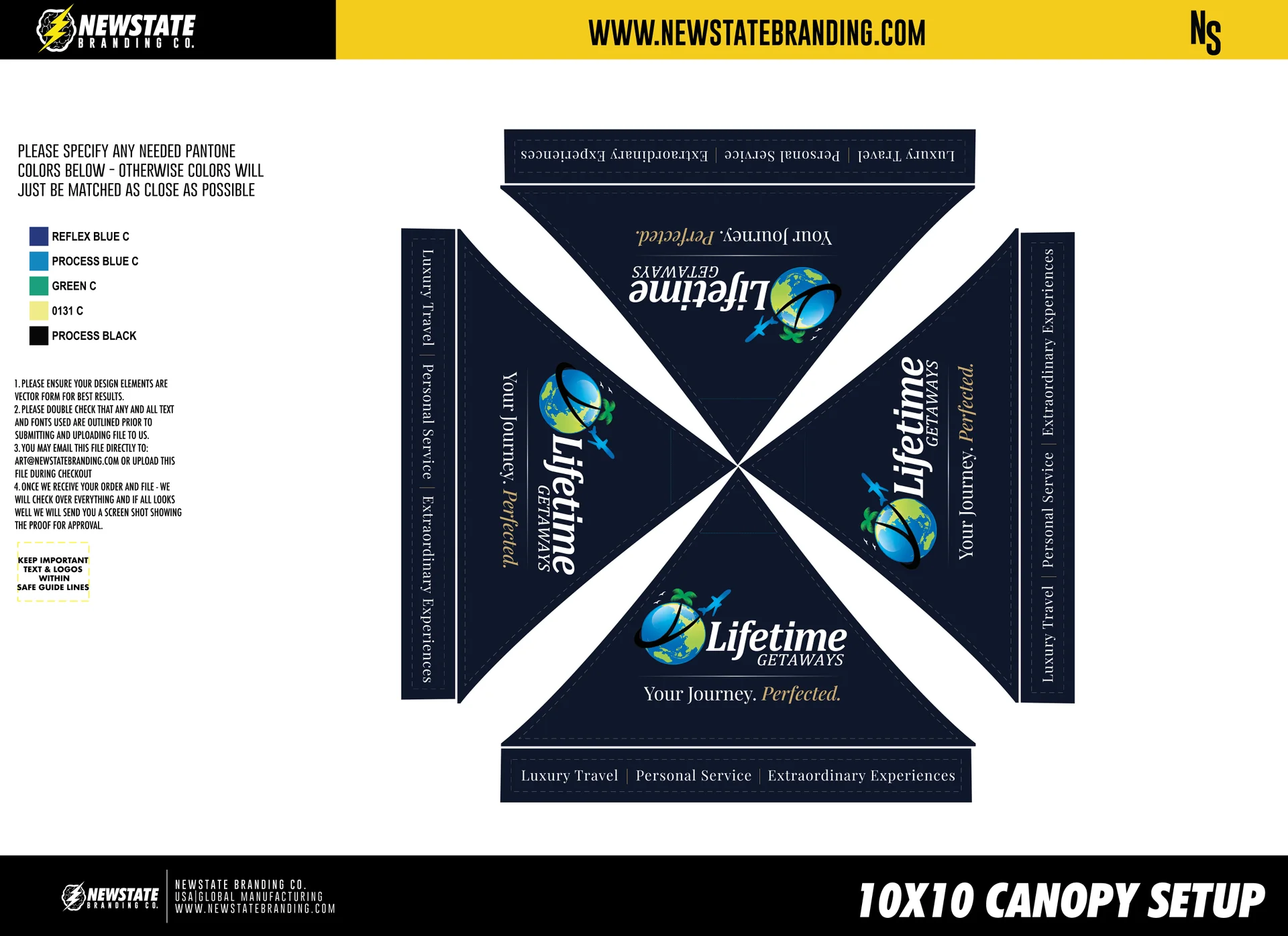
The real print file
Every logo, line of text and color sits exactly where it will print, at the true size and position. It's the most accurate way to check your setup, so this is the one you approve.
Just a picture
A 3D render wraps your design onto a model. Camera angles, lighting and stretching can throw off proportions and make things look bigger, smaller or off center. Fun to look at, but not something to approve from.
Check every panel
Your proof shows each piece on its own: canopy top, walls, flags, table cover. Go through them one by one.
Mind the safe lines
Keep important text and logos inside the safe guide lines on the template, so nothing ends up in a seam or around a corner.
Read it like a printer
Double-check spelling, phone numbers, web addresses and QR codes. Whatever's on the proof is exactly what gets printed.
Want to see how flat proofs turn out in real life? Check out real customer setups →